Skip to content
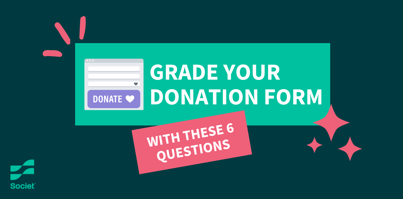
Put yourself in your donors’ shoes for a moment. You’ve received communications from a local food pantry promoting an upcoming Fun Run to support children experiencing food insecurity. Moved by emotional storytelling and powerful statistics, you click the “Donate Now” button. After waiting several seconds for the page to load, you find a lengthy form riddled with glitches and confusing questions. Frustrated, you decide to come back to the page later—only you ultimately forget and never end up donating to the fundraiser.
Many supporters drop off at this phase of the donor journey, discouraged by small friction points like slow page load speeds or form malfunctions. To pinpoint and fix those obstacles, you’ll need to critically examine the current version of your donation form and make user-focused improvements.
This guide walks through essential questions every organization should ask to assess the quality of its donation form.
1. Is the form mobile-friendly?
With 57% of nonprofit website traffic coming from mobile devices, it’s essential to consider mobile design. A mobile-friendly form should automatically resize its contents to fit smaller screens (i.e., tablets and smartphones). The best way to test this is by accessing your form using a mobile device and asking yourself:
- Are load times under three seconds, or, ideally, between zero and two seconds?
- Is the text legible without pinching or zooming?
- Are buttons, fields, check boxes, and other interactive elements large enough to tap easily?
- Is the tap-to-type experience smooth?
- Are dropdowns and date selectors easy to use and view on small touchscreen devices?
2. Are you only asking for necessary information?
Donors may abandon a donation form that feels long or invasive. While it’s tempting to use this form to gather information about your supporters, asking them twenty questions (or more) or requiring them to give personal information like their phone number can be off-putting.
Revisit the content in your form and consider the following:
- Is each question on the form truly essential to accepting a donation?
- Could some details, like employer information, be collected after the donation via a follow-up email or thank-you page?
- Is the form broken into manageable steps (e.g., stages for collecting contact information, donation details, and payment information)?
- Do any of the questions require additional materials or take more than a minute to complete?
3. Is it easy to find your donation form?
Even the best, most streamlined form can’t help you secure donations if supporters can’t find it in the first place. This is why 99Pledges recommends sharing your donation page with supporters online by linking to it in social media posts, emails, and other virtual communications.
However, there will likely be some donors who seek out your donation form by navigating to your website. Mimic this journey by attempting to navigate to the donation form from your website’s homepage, making note of:
- How many clicks it takes to reach the form
- Whether there are clear calls to action on relevant pages that link to the form
- Whether the button stands out in the menu or on the page
- If the donation form has its own shareable URL and/or share buttons
4. Are you making a compelling case for support?
Don’t just think of your donation form as a transaction. It’s another opportunity to share your story and impact using beneficiary stories and data stored in your case management software and CRM.
First, identify what strategies you’re currently using on the donation form to encourage supporters to give. Using the following questions as a guide, consider ways you can strengthen your case for support:
- Does the form include tangible details about the impact of a gift?
- Are there images, quotes, or testimonials that reinforce your mission?
- Are there any statistics that highlight the impact of your past efforts (e.g., “100,000 families fed”)?
- If your form includes them, are the metrics or testimonials more than five years old? If so, consider updating them.
5. Have you tested your form recently?
Kanopi’s guide to website maintenance recommends regularly testing any forms hosted on your site, including donation forms, volunteer applications, quizzes, and feedback surveys. After all, form glitches, confusing language, or broken links can stop a potential donor from completing that last step in the process.
Here is a checklist of tasks to complete during each test to confirm that the form will work for various types of donors:
- Access the form via desktop, tablet, and smartphone
- Test the form on different browsers
- Try using all of the different payment methods your form accepts to ensure payment processing runs smoothly
- Act like different types of donors or audience segments, such as first-time donors, recurring donors, etc.
- Purposely “break” the form by skipping required fields to ensure the form’s safeguards work properly
- Time how long it takes to complete the form, and determine which parts of the process take the longest
Quick Tip: Test your donation form each month using the checklist above. Review metrics like traffic, conversions, time spent on the page, and bounce rate just as often to catch potential issues early.
6. Are you optimizing for recurring gifts?
Recurring donations provide critical financial stability. For example, let’s say you’re raising money for your cause with a Walk-a-thon fundraiser. While you might knock your fundraising goal for that campaign out of the park, you’re leaving future revenue on the table by not promoting recurring gifts.
To recruit more donors into your monthly giving program, reflect on these questions:
- Does your form prominently offer a recurring option (e.g., “Would you like to make this a monthly gift?”)?
- Is monthly giving the default (if appropriate)?
- Do you succinctly explain the importance or long-term impact of recurring support?
- Can donors easily opt in or out of monthly giving in just one click?
Did your donation form score an A+, or do you have some opportunities for improvement? Either way, by taking the time to ask the right questions and make thoughtful improvements, you can transform the form into a powerful engine of generosity. Remember that even small tweaks, like simplifying fields or improving mobile layout, can significantly impact donor experiences and your fundraising revenue.