Running a nonprofit is a mission-driven endeavor that requires smart budgeting, careful planning, and powerful tools that won’t drain your limited resources. Fortunately, there’s a growing ecosystem of free nonprofit software that can help you manage everything from accounting and donations to CRM and board meetings.
In this guide, we explore some of the best free software for nonprofit organizations across key categories. Whether you’re just starting out or looking to expand your digital toolkit, these tools can support your goals without adding strain to your budget.
Donation / Fundraising Software
Fundraising is at the heart of most nonprofit operations. The right tool can make donation management more efficient, transparent, and impactful.
Featured Tool: Glass Register
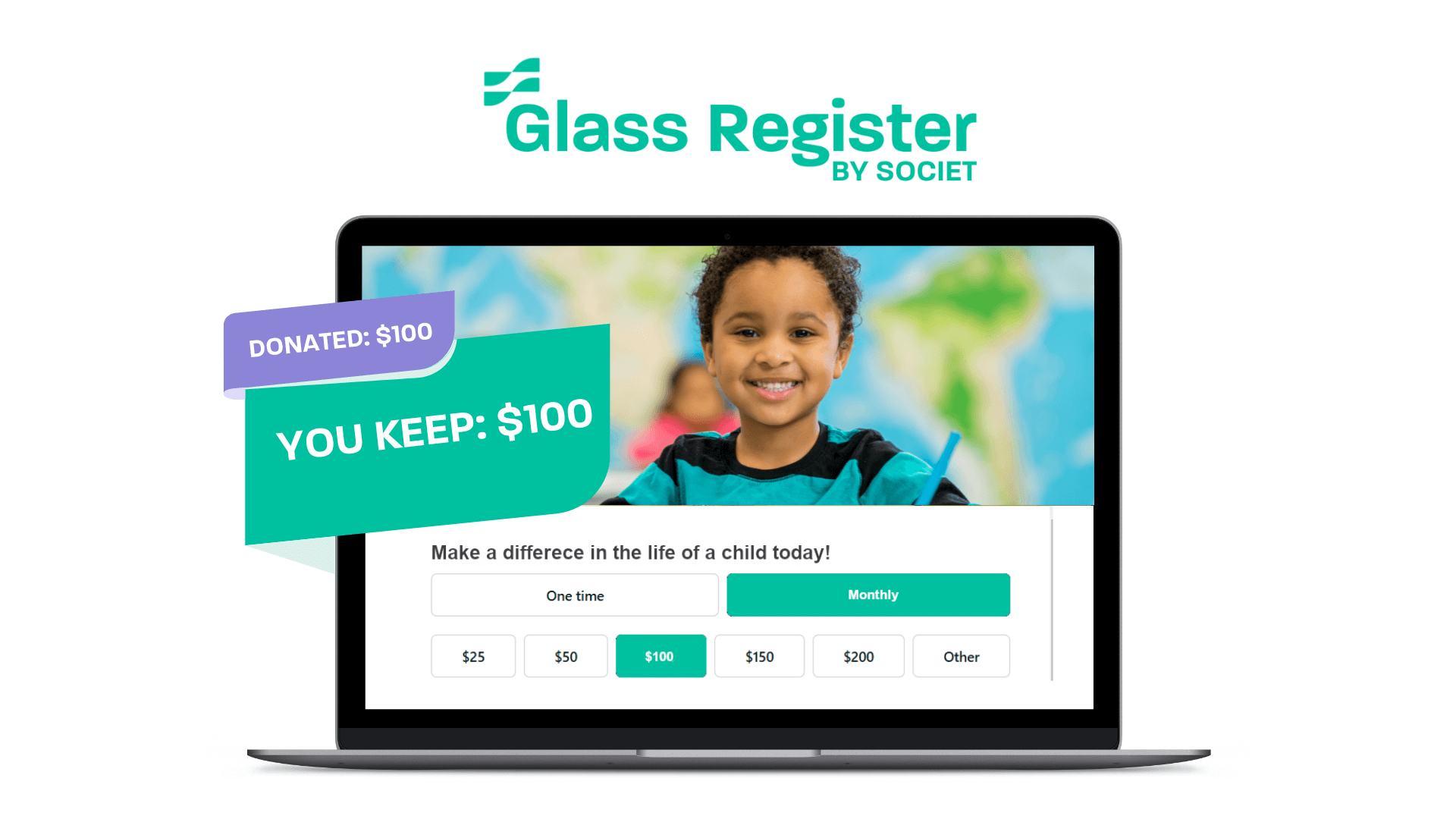
Glass Register provides nonprofits with zero-fee donation forms, allowing you to keep 100% of every donation. There are zero transaction fees, zero credit card fees, and zero platform fees, so every dollar goes directly to your mission.
- Free forever for nonprofits
- Accepts donations online with ease
- Free premium form setup and customization service
- Generates real-time reports for financial transparency
- Custom branding options for campaigns
Why It Stands Out: Glass Register combines sleek design with robust functionality. It offers what many paid fundraising platforms do—but without the price tag. If you’re looking for free software for nonprofit organizations that helps streamline giving and boost donor confidence, this is a must-try.
- Donorbox
- GiveWP (basic plan)
- Qgiv (free for peer-to-peer campaigns)
- PayPal Fundraising Tools
- Network for Good (limited free access)
These options expand your access to free nonprofit software for managing online giving and donor engagement.
Accounting Software
Keeping track of your finances is crucial—not just for compliance, but for maintaining trust with donors and stakeholders. While many accounting tools can be expensive, there are excellent free nonprofit accounting software options available.
Featured Tool: Wave Accounting
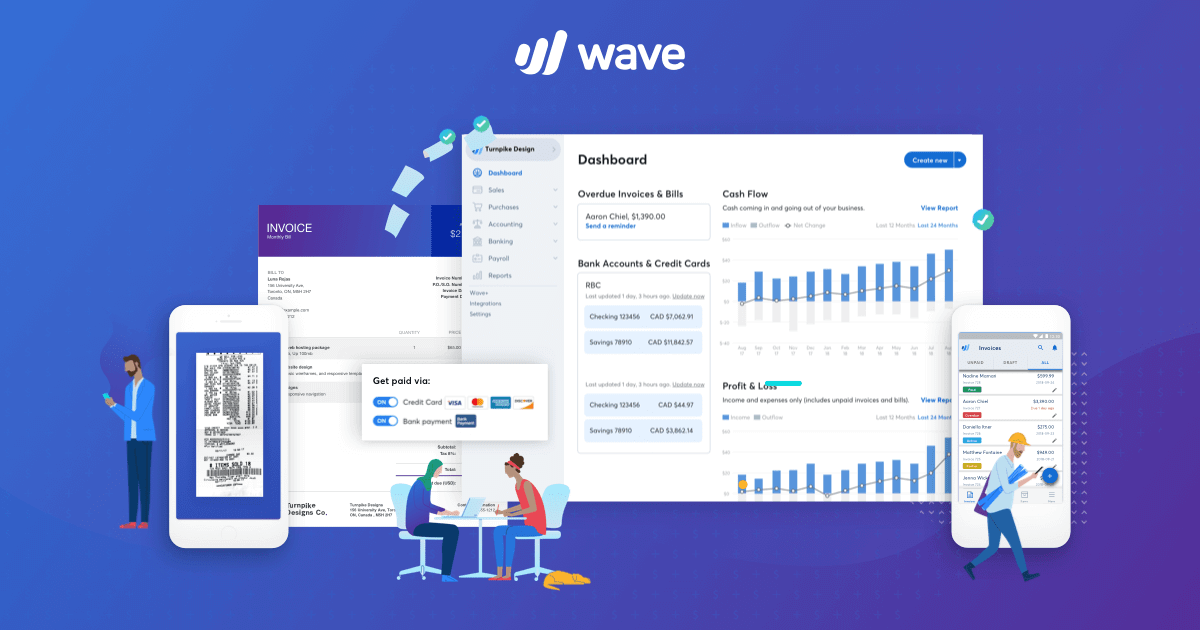
Wave Accounting is one of the most popular options for small businesses and nonprofits alike. It offers a full suite of accounting tools—completely free.
- 100% free with no hidden fees
- Tracks income and expenses
- Offers invoicing, payroll (paid), and receipt scanning
- Real-time financial dashboard
- Customizable reports and categories
Why It Stands Out: Wave is particularly attractive for its intuitive interface and cost structure. As a free nonprofit accounting software tool, it eliminates the need for spreadsheets while giving you a full financial picture of your organization.
- ZipBooks (Starter Plan)
- Akaunting
- GnuCash
- MoneyMinder (basic version for nonprofits)
- QuickBooks Online for Nonprofits (with nonprofit discounts)
These tools offer a variety of features and ensure access to free software for nonprofit organizations that need robust, scalable accounting tools.
Board Management Software
Managing a nonprofit board involves more than just scheduling meetings. You need to track decisions, share documents, and ensure accountability. That’s where free nonprofit board management software comes in.
Featured Tool: My Board View
My Board View is a 100% free board portal designed to simplify board management for nonprofits. It helps your board stay informed, productive, and organized—all from one easy-to-use dashboard.
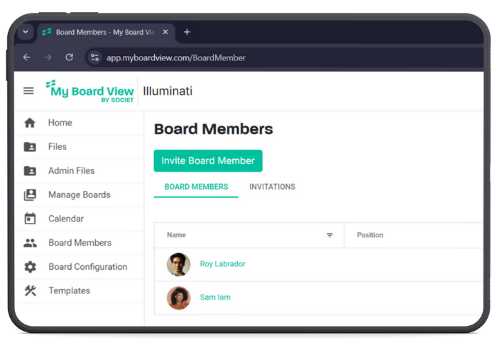
- Secure document sharing
- Tracks votes, tasks, and meeting minutes
- Creates structured meeting agendas
- Integrates with calendars and email
- Free for nonprofits
Why It Stands Out: My Board View was built specifically with nonprofit boards in mind. It’s not just a generic task manager—this is purpose-built free nonprofit board management software that enhances governance without adding complexity.
- Boardable (free trial available)
- BoardEffect (limited free offerings)
- OnBoard (demo access)
- Google Workspace for board document sharing
- Diligent (for basic board resource centers)
Add these to your list of free software for nonprofit organizations supporting leadership and compliance.
CRM Software
A good CRM (Customer Relationship Management) tool helps you track relationships with donors, volunteers, and other stakeholders. CRM systems are essential for donor engagement, grant tracking, volunteer management, and reporting. While many vendors promote “free” solutions, it’s important to read the fine print.
Featured Tool: Salesforce for Nonprofits (NPSP)
Salesforce Nonprofit Success Pack (NPSP) is a “free” CRM platform for eligible nonprofits. It includes 10 free licenses and access to their extensive suite of nonprofit tools.
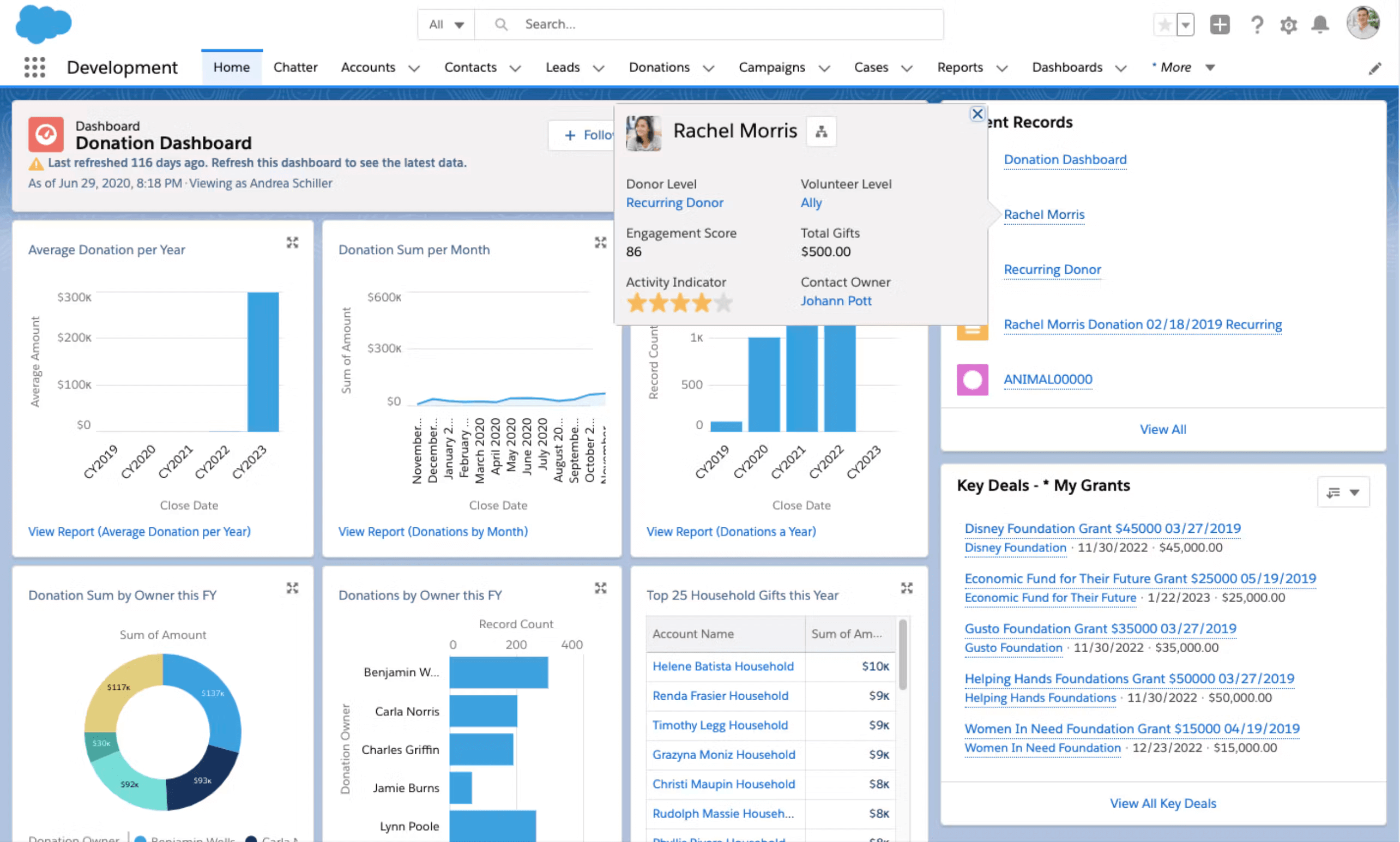
- 10 free user licenses with access to the Salesforce ecosystem
- Donor, volunteer, and campaign management
- Integration with popular fundraising and marketing platforms
- Highly customizable with apps and extensions
- Extensive training and support materials
Why You Should Be Cautious: While Salesforce for Nonprofits is technically free, it often requires a significant investment in setup, customization, and ongoing consulting. Many nonprofits report needing to hire third-party consultants to make the most of the platform. As such, it may not be truly “free” in practice.
Recommended Alternative: Sumac CRM
Sumac CRM is the smart CRM for human & social service organizations. It is ideal for nonprofits that need something more intuitive, affordable, and out-of-the-box than Salesforce – that can still be tailored to your nonprofit’s unique needs.

- Designed specifically for nonprofits
- Easy-to-use interface
- Manages clients, donors, volunteers, memberships, and grants
- Affordable pricing with scalable upgrades
- A $1,000 grant is available for small organizations
Why It Stands Out: Sumac delivers robust features without the steep learning curve or hefty customization costs. It’s a great option for those seeking reliable nonprofit CRM software or a low-cost alternative to more complex platforms.
- Givebutter
- CiviCRM (open source)
- HubSpot CRM (with nonprofit discount)
- Bitrix24
- Zoho CRM for Nonprofits (free tier available)
These tools enhance your options when looking for reliable free nonprofit CRM software and free software for nonprofit organizations.
Project & Task Management Software
Managing projects and tasks is essential for nonprofit teams, especially when staff and volunteers are distributed. Look for software that offers collaboration features without a steep learning curve.
Featured Tool: Trello
Trello is a kanban-style task manager that’s easy to adopt and powerful enough for most teams.

- Free for nonprofits
- Drag-and-drop task cards
- Assign due dates and checklists
- Commenting and file uploads
- Mobile and desktop apps
Why It Stands Out: Trello makes it simple to coordinate across departments and keep everyone in the loop. It’s a great addition to your stack of free software for nonprofit organizations.
- Asana (basic plan)
- ClickUp (free forever tier)
- Airtable (free nonprofit plan)
- Notion (free for nonprofits)
- Monday.com (discounted nonprofit plan)
These tools are valuable pieces of the free nonprofit software ecosystem.
Communication Tools
Effective communication keeps everyone aligned—whether you’re planning events, sharing updates, or rallying support. Free communication tools can play a vital role.
Featured Tool: Slack for Nonprofits
Slack for Nonprofits offers a 100% free version for all users and a special nonprofit discount for upgrades. It centralizes messaging, file sharing, and integrations in one platform.
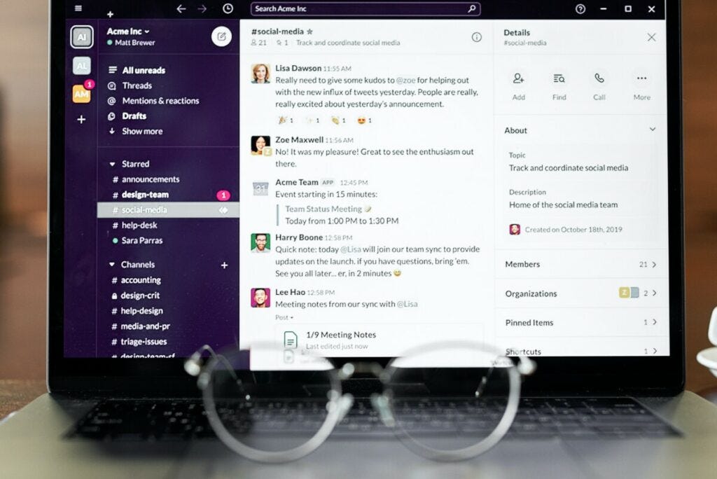
- Organize messages by topic (channels)
- Send private messages or group chats
- Integrates with Google Drive, Trello, Zoom, and more
- Mobile and desktop compatibility
Why It Stands Out: Slack helps nonprofits cut down on email overload while improving collaboration. It’s a great communication hub and qualifies as free software for nonprofit organizations with no strings attached.
- Microsoft Teams (free plan)
- Google Meet via Google Workspace for Nonprofits
- Zoom (free version with time limits)
- Discord
- Signal (for private messaging)
Each of these tools contributes to the free nonprofit software landscape.
Email Marketing Software
Staying in touch with donors, volunteers, and members is critical. Email marketing helps you maintain engagement and drive action.
Featured Tool: MailerLite
MailerLite offers a robust free plan with a drag-and-drop builder, templates, automation, and analytics.
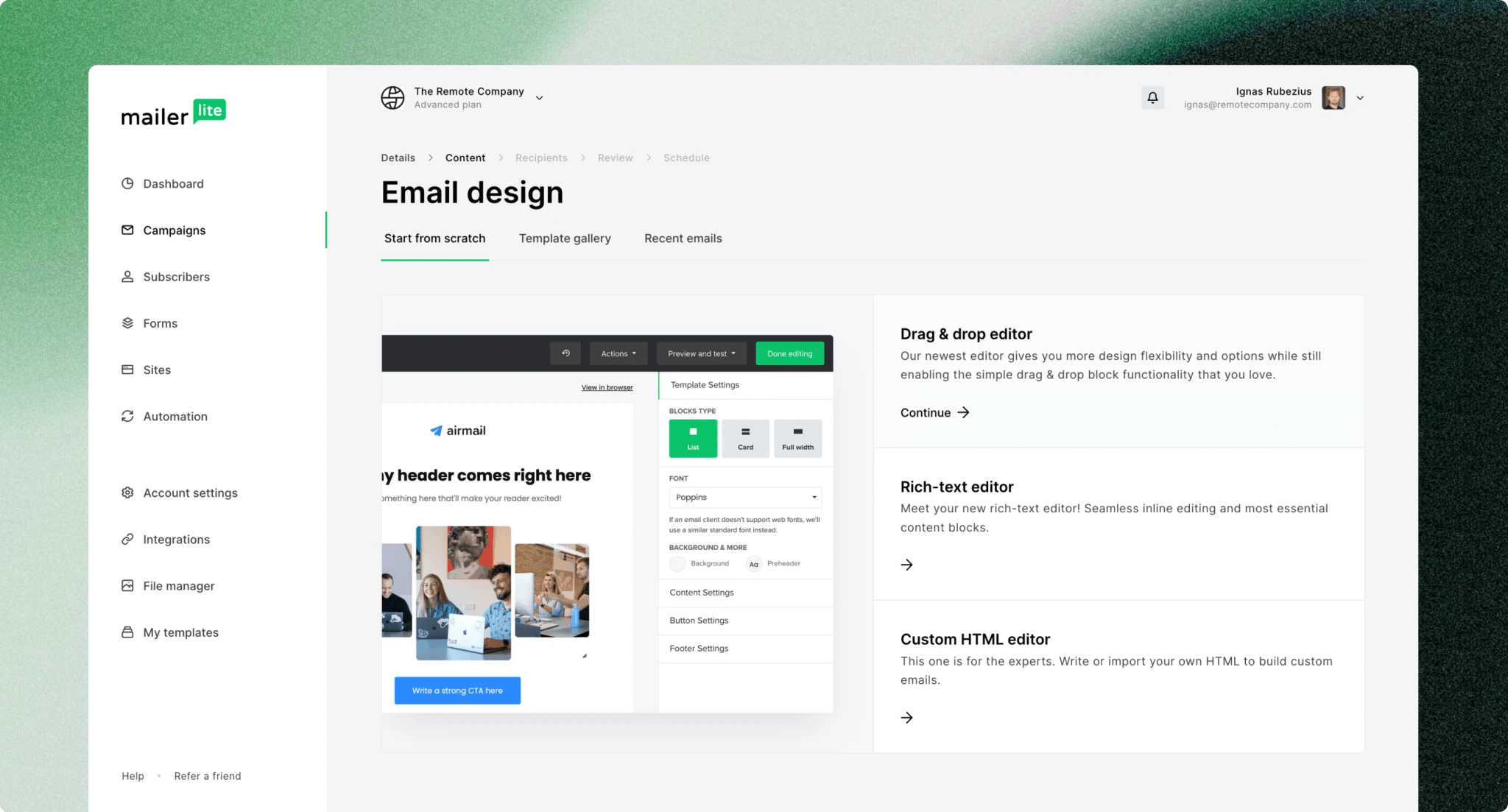
- Up to 1,000 subscribers for free
- Unlimited emails
- Marketing automation and landing pages
- Easy-to-use campaign builder
Why It Stands Out: MailerLite is one of the most generous free plans out there for nonprofits. It’s perfect for organizations looking to engage supporters on a budget.
- Mailchimp (free plan)
- Sender
- Sendinblue (Brevo)
- Benchmark Email
- EmailOctopus
These expand your toolkit of free software for nonprofit organizations looking to boost donor communication.
Design Tools
Visual storytelling is essential in nonprofit work—from fundraising campaigns to social media outreach. A strong visual presence helps you connect with your audience, showcase impact, and promote events. Fortunately, there are powerful design tools available as free software for nonprofit organizations.
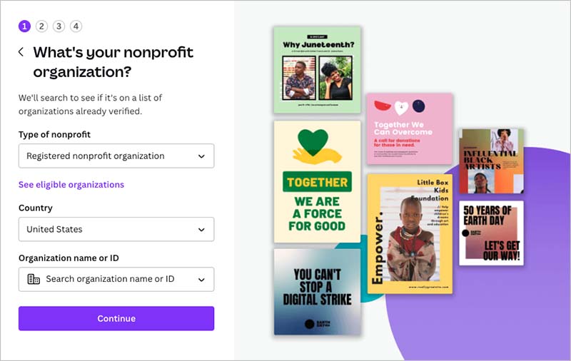
Featured Tool: Canva for Nonprofits
Canva offers a free premium plan for eligible nonprofits, which includes advanced features that would otherwise be part of their Pro plan.
- Access to premium templates, images, and graphics
- Brand kit for consistent design
- Drag-and-drop interface for ease of use
- Resize designs for multiple platforms in one click
- Collaborate with team members in real time
Why It Stands Out: Canva for Nonprofits allows organizations to create stunning, on-brand visuals without needing a professional designer. It’s ideal for social media, newsletters, presentations, and fundraising campaigns.
- Adobe Express (formerly Spark) with nonprofit access
- Figma (free for individual use or nonprofits upon request)
- Piktochart (for infographics and reports)
- GIMP (open-source photo editor)
- Visme (free version with templates)
These tools help expand your capabilities with free nonprofit software that supports branding, outreach, and advocacy campaigns.
Bonus Tools for Nonprofits
Free AI Tools
Free Fundraising Tools
Final Thoughts
Choosing the right tools can empower your nonprofit to do more good with fewer resources. Whether you need free nonprofit accounting software, free nonprofit CRM software, or free nonprofit board management software, there are real, high-quality options that won’t cost you a cent.
- You save valuable budget
- You increase operational efficiency
- You maintain compliance and donor trust
Don’t be misled by marketing. Not all “free” tools are created equal. Do your homework and choose options—like Glass Register, My Board View, and Sumac – that are built with nonprofits in mind.
